Using ReactJS and Bulma
An extremely powerful combination for web development is a combination of ReactJS (for the HTML view) and Bulma for the css styling of the application. It's a great web application starter.
NOTE: There is a github repository with the code in for this tutorial.
Getting Started
In order to get started, we need a new ReactJS application. Go ahead, and as per the online ReactJS tutorial, get a new project up and running with:
Make sure the project has built ok by testing it out:
Your browser should point you to a ReactJS application that looks a bit like this:

Great - we've got our ReactJS demo started. Next, we'll add Bulma in.
Installing Bulma
In order to get started, we need a ReactJS wrapper for Bulma. There is a great one, react-bulma-components which wraps Bulma for use in ReactJS applications.
From within the root of the new project type:
This installs the Bulma ReactJS components ready for us to import into our project.
Adding a Bulma Component
Bulma has a lot of components, all wrapped up and waiting for you to use in your application. But let's start out right from the beginning. One major advantage of modern CSS is SCSS or SASS which provide us with compilable CSS - enabling us to theme and adjust settings using variables. It's really handy to have that stuff and as with everything, it's best to bake it in a the start.
Adding SASS Support
From inside the project root, install the node-sass module:
In the project root, create a new file called jsconfig.json with the following content:
In the /src/ directory create a new file called _variables.sass. This is what the Bulma SASS will use to override CSS variables. Even if it's unused, it should be included in the project to prevent the Bulma SASS from failing to compile.
Rename /src/App.css to /src/App.scss so it will get compiled rather than just be included.
At the top of the /src/App.scss file, add the following line to import the Bulma (Compilable) css:
In the /src/App.js source file, change the App.css import to be App.scss now.
Add a Bulma button
We can noe import a button for example to use:
At the top of /src/App.js, underneath the import React... line, you can add the following to import the Button component:
Now we can go ahead and add the imported button component to the page. Let's add the button component under the main paragraph text in the example. Immediately after the paragraph lets add the button as simply as we can:
Now when you run npm start in the project's root you should see something with a Bulma button in:

The SASS enables us to change CSS colours easily. In the src/_variables.sass file add the following line to change the primary colour used by Bulma SASS:
Now, you'll see (perhaps after a page reload) that the c;olour of the button has turned orange. All components basing themselves off of the primary colour will be affected throughout the CSS stack.

Creating a New Component
In order to do something useful we want to create what's known as a component in ReactJS. Let's take the SVG logo and make it a component. Then we can look at doing something funky with it.
Checkout git commit 8535c88 for this part of the tutorial.
We add a new components directory to the source code so we have somewhere to dump our component source code. In a new file we create a new component called Logo.
The following content is in src/components/logo.js. I'm sure you could do Typescript here too.
import React from 'react';
import logo from '../logo.svg';

export default class Logo extends React.Component {
    constructor(props) {
        super(props)
        this.state = {
            style: {
                transform: 'scale(1)'
            }
        }
        this.handleMouseEnter = this.handleMouseEnter.bind(this)
        this.handleMouseLeave = this.handleMouseLeave.bind(this)
    }

    handleMouseEnter(event) {
        this.setState((state, props) => ({
            style: {
                transform: 'scale(1.5)'
            }
        }))
    }

    handleMouseLeave() {
        this.setState((state, props) => ({
            style: {
                transform: 'scale(1)'
            }
        }))
    }

    render() {
        return (
            <img src={logo}
                className="App-logo"
                style = { this.state.style }
                alt="logo"
                onMouseLeave={this.handleMouseLeave}
                onMouseEnter={this.handleMouseEnter} />
        );
    }
}
This component imports React - so we can extend the React.Component class to create our component.
It imports the Logo image as an SVG in exactly the same way as the original test React application does.
Then, creates a new class by extending the React.Component base class - here we create a class constructor that first constructs the base class object (super) with the properties that have been passed in.
After that we create a state object bound the class. This state object must only be altered through the react framework's setState function. This is so that rendering changes, which are required to happen on the server-side are does as efficiently as possible. If the render function makes use of state then the class knows that it needs to re-render itself and update the component's view.
We have added in some event handling for this component. This nicely wraps up a HTML view object and it's related JavaScript support.
All the callbacks do are change the scale of the SVG image when the mouse hovers. We could of course do this much more simply in pure CSS, but we're here to investigate how Bulma and React work and how they can work together. I'm very much learning as I go.
The render function of the class returns the view. It makes use of the component's state. Using the state doesn't need to be wrapped in a get function, but setting the state must as we've already established be wrapped with the setState function.
We can investigate that further later on. We simply return a single image element. Normally we'd wrap the contents returned in a container div. I just wanted the minimum possible here for now. From the render method, we must only have one outer element. Thus, if we want to return an image and a paragraph, that's fine - but both must be wrapped in a div or similar element as a container.
If you're familiar with JavaScript then you'll be familiar with the bind(this) construct that's going on here. It's a little laborious, but it must be done for the event handlers to be bound to the class object and therefore be able to make use of this to reference the class object. Without these bind calls, the event handlers would have no knowledge of the class in which they're defined.
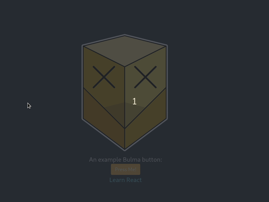
When you run this commit, we get something like this: